Project Controls Dashboard Design Masterclass

What a dashboard is actually for
A project controls dashboard exists to compress the state of a project into a small number of visual signals that a decision-maker can absorb in less than a minute and act on within the same meeting. It is not a database, not a report, not an audit trail. The fastest way to ruin a dashboard is to confuse it with any of those three artefacts and try to make it do their job. Each has its own format, its own cadence and its own audience.
The defining test of a good dashboard is whether someone who did not build it can answer three questions from a single screen: is the project on track, where is the largest active risk, and what decision is required this week. If a viewer needs a tour to understand the layout, a glossary to interpret the metrics, or a follow-up call to learn what to do, the dashboard has failed regardless of how visually polished it is.
The corollary is that dashboards should be ruthlessly audience-specific. An executive sponsor needs a different view from a programme director, who needs a different view from a project controls manager, who needs a different view from a discipline lead. The same data, filtered and visualised differently, supports four legitimate dashboards. Trying to serve all four with a single screen produces a busy display that serves none of them well.
Audience-first KPI selection
Every dashboard begins with a brutal exercise in subtraction. List every metric the team currently tracks, then ask, for each, who decides what with this number and how soon. Metrics that fail the test — no decision-maker, no decision, no action window — should not appear on the dashboard. They may still be tracked in underlying systems, but their place on the screen costs attention that a more decision-relevant metric could be using.
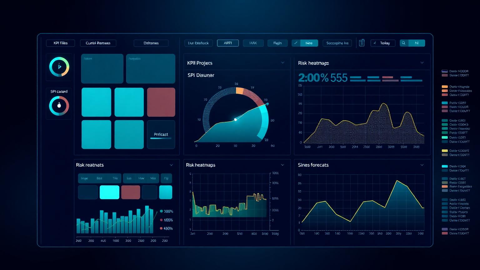
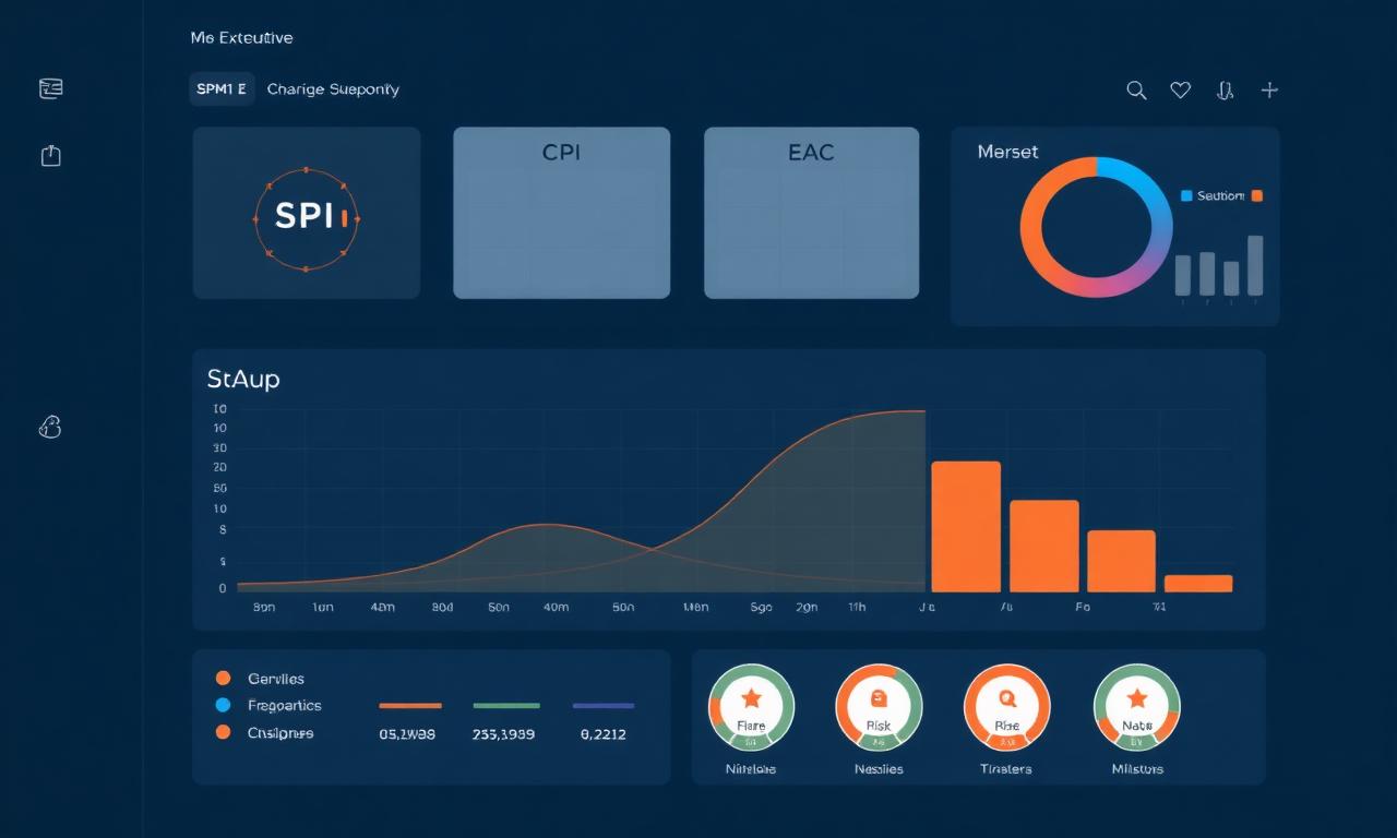
For an executive audience the minimum useful set is usually four to six KPIs: schedule performance, cost performance, forecast at completion, top risk exposure, milestone status and a leading-indicator KPI such as float erosion or productivity trend. Anything beyond that begins to compete for attention with the few numbers that genuinely matter at executive level.
For a PMO audience the set is broader because the PMO is the layer that has to act on the detail. SPI and CPI by control account, top ten variances, top ten risks by exposure, change-order pipeline, milestone slip register, EAC range and a schedule-quality DCMA score together make a useful PMO weekly view. For a project controls manager the set widens again to include resource loading, productivity factors, accruals and unbilled work, and contingency draw-down.
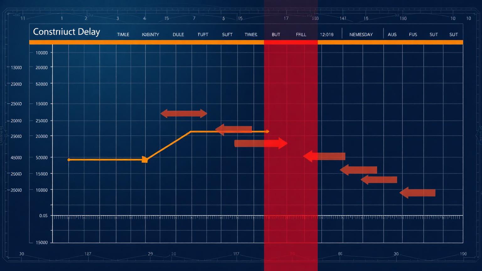
EVM at the heart of the dashboard
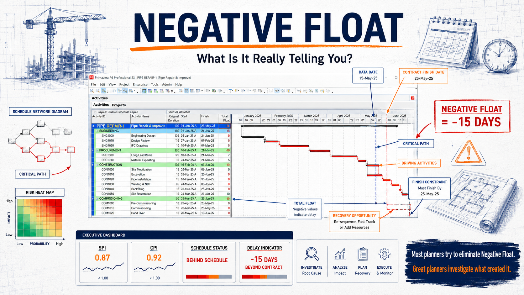
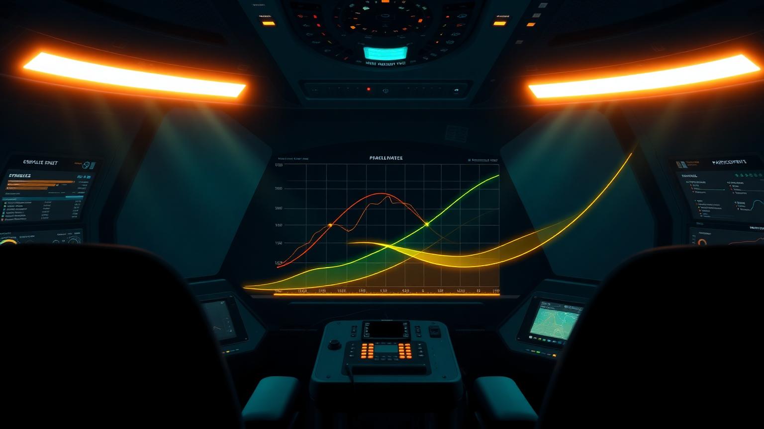
Earned Value Management is the most powerful and most misused content on most project dashboards. Done well, SPI and CPI together with the planned and earned value curves give a single, comparable view of schedule and cost performance across any project, any sector, any contract type. Done badly, they produce false reassurance because the underlying earning rules are weak or the baseline is stale.
On a well-designed dashboard, EVM appears in three forms. First, a small SPI and CPI tile with a coloured trend indicator, sized to be readable in two seconds. Second, a planned-versus-earned S-curve, normally with actual cost overlaid, sized to be readable in fifteen seconds and showing at least the last six periods. Third, a forecast at completion range with EACt (time) and EACc (cost), sized to be readable in thirty seconds and accompanied by the assumption used to derive it.
Beyond those three forms, EVM should normally be relegated to drill-down views rather than competing for space on the headline screen. Adding TCPI, CV, SV, VAC and ETC tiles to the headline display rarely adds insight; it adds clutter, which reduces the chance that the SPI and CPI tiles will be read at all.
Risk indicators that change behaviour
Risk visualisations on dashboards routinely degenerate into colourful matrices that no one acts on. The cause is almost always presentation rather than analysis: the risk register is sound, but the dashboard reduces it to a heatmap with no exposure values, no trend, and no link to the decisions required. The fix is to lead with monetary exposure and trend, not with probability and impact ratings in isolation.
An effective risk panel on an executive dashboard shows top five risks by current expected monetary value, the change in exposure since the last period, the next decision date for each risk, and the owner. The familiar five-by-five matrix can sit alongside as supporting context, but the decision-relevant content is the exposure trend and the next decision date.
For longer projects, the leading indicator most worth surfacing is contingency draw-down compared to expected schedule progress. If contingency is being consumed faster than the schedule is advancing, the project is quietly accumulating risk exposure regardless of what the headline performance indicators say. That one visualisation has saved more programmes than any number of heatmaps.
Layout, hierarchy and visual discipline
Information design principles apply to dashboards the same way they apply to any visual communication. The eye reads top-left first in most western contexts, so the most important KPI should sit there. Tiles should be grouped by audience question rather than by data source — performance together, forecast together, risk together — so that the dashboard mirrors how the viewer thinks rather than how the underlying systems are structured.
Colour should be reserved for status, not for decoration. A dashboard that uses ten colours to brighten up its panels destroys the meaning of the red, amber and green that should signal status. A disciplined palette is monochrome for structure with two or three accent colours reserved for performance and risk signals. White space is not wasted space; it is the silence between the signals that lets each one register.
Typography should be functional. A single display font for headings and a single sans-serif for numbers and labels is usually enough. KPI numbers should be larger than anything else on the screen, because they are the content people came to read. Long descriptive labels should be replaced by short, conventional abbreviations once the reader has been trained on the dashboard's vocabulary.
Construction dashboards have specific needs
Construction projects benefit from dashboard views that combine the controls picture with the realities of site delivery. A construction-flavoured dashboard typically replaces some of the financial KPIs with productivity factors (planned-versus-actual hours per quantity), curve charts for major commodities (concrete, steel, cabling, piping), and a near-term look-ahead derived from the three-week rolling programme.
Subcontractor performance deserves its own panel on most construction dashboards. A simple traffic-light view of the major subcontractors by schedule, productivity, quality and safety is more decision-useful than a single combined score. Owners and EPC contractors who track this consistently spot underperforming sub-contractors months before the issue would otherwise become visible.
Safety should always appear on a construction dashboard, but never in a way that lets it be confused with performance. Leading indicators — observations, near-misses, audit closure rates — are far more useful than lagging incident counts and should be visualised in their own dedicated zone, not blended into the project performance section.
Common dashboard mistakes
The most common mistake is over-population. Dashboards that show thirty or forty KPIs on a single screen are not dashboards; they are spreadsheets in disguise. The viewer cannot prioritise and so prioritises nothing. The fix is subtraction, repeatedly, until every element on the screen has a clear decision owner.
The second most common mistake is false precision. Reporting SPI to three decimal places, EAC to the nearest dollar on a billion-dollar project, or contingency utilisation to a fraction of a percent suggests an analytical certainty the underlying data does not support. Round honestly. Decision-makers trust dashboards that look like decisions and distrust dashboards that look like calculations.
The third common mistake is mixing reporting periods on the same screen without saying so. A productivity KPI from last week, a financial KPI from the last accounting close, a risk KPI from the most recent risk review and a milestone status from this morning may all coexist on the same dashboard, but the viewer needs to know which is which. A small period stamp on every panel solves this entirely and is omitted far too often.
The fourth common mistake is decorative animation. Subtle motion can guide attention; gratuitous animation undermines credibility. If a chart pulses, rotates or otherwise moves for non-informational reasons, executives will read the dashboard as marketing rather than reporting and behave accordingly.
Dashboard build process: from spec to release
Dashboards should be built the same way good products are built. Start with a written specification that lists the audience, the questions the dashboard must answer and the decisions it must support. Sketch the layout on paper before opening any tool. Build a low-fidelity prototype with placeholder data and test it with representative users from the intended audience before any production data is connected. Most dashboard failures are baked in at the specification stage, not at the build stage.
Data quality matters as much as visual design. A beautiful dashboard fed by unreliable data is a liability, not an asset, because it lends visual authority to numbers the team cannot defend. Before launch, every KPI should have a documented data source, a documented calculation, a documented refresh cadence and a named owner accountable for its accuracy. Without these four, the dashboard will degrade within months as data sources drift.
Release should be staged. Pilot the dashboard with one project or one PMO area, gather feedback, iterate, and only then roll out across the portfolio. Dashboards that are designed in a vacuum and released across an organisation in one go almost always trigger a wave of complaints and rework that could have been absorbed in pilot.
Tooling realities and pragmatic choices
Tool choice is less important than discipline, but it is not irrelevant. Power BI, Tableau and similar platforms each have strong communities and patterns that make decent dashboards relatively easy and great dashboards possible with effort. Native dashboards inside Primavera P6, EcoSys and other controls tools are usually weaker visually but stronger in data integration.
For most organisations the pragmatic choice is a combination: data integration handled close to the source systems, then a presentation layer built in a dedicated BI tool that the broader business already uses. Insisting on a single tool for both layers usually compromises one of them. The interface between the data layer and the presentation layer is where most of the long-term maintenance cost sits, so it should be designed deliberately rather than improvised.
Whichever tools are chosen, the dashboard must survive the analyst who built it. Documented data lineage, version-controlled report definitions and at least one back-up author who can extend the dashboard are not optional. A dashboard that only one person understands is a single point of failure dressed up as project intelligence.
Putting it into practice this week
Practitioners reading this masterclass can put it to work without waiting for a major dashboard refresh. Pick the dashboard you send most often, apply the three-question test (is the project on track, where is the largest risk, what decision is needed this week), and remove anything on the screen that does not contribute to one of the answers. The screen will become quieter, the next executive review will become faster, and the difference will be noticed within a month.
Pair the cleanup with a single new addition: a leading indicator panel that did not previously exist. Float erosion, SPI trend, contingency draw-down versus progress, or the change-order pipeline are all good candidates. A leading indicator that quietly turns red two weeks before a problem becomes visible to leadership is the single most valuable element a dashboard can carry.
Finally, treat the dashboard as a product, not a deliverable. Maintain a small backlog of improvements, review it monthly, and version the dashboard so that you can see how the design has evolved over time. The dashboards that drive real decisions in real organisations are almost always the ones that have been quietly refined for years, not the ones that were polished spectacularly once and then frozen.
Frequently asked questions
How many KPIs should an executive dashboard have? Four to six is a reasonable upper bound. Beyond that, attention fragments and the dashboard begins to fail its primary purpose.
Should risk be on the same screen as performance? Yes, but in its own panel with monetary exposure and trend, not buried in a generic heatmap.
Is BI tooling required? Useful but not essential. A clean, disciplined dashboard in any tool will outperform a busy, decorative one in the most sophisticated platform.
Frequently asked questions
How many KPIs belong on an executive dashboard?
Four to six is a sensible upper bound. Beyond that, attention fragments and the dashboard fails its purpose.
Which EVM metrics should be on the headline screen?
SPI and CPI tiles with trend, a planned-versus-earned S-curve and a forecast at completion range. Other EVM metrics are best moved to drill-down views.
How should risks appear on a dashboard?
Lead with monetary exposure, trend since last period, next decision date and owner. The five-by-five matrix is supporting context, not the headline.
Academy articles that build on this pillar
These newer Academy articles reference this Knowledge Pillar directly — continue with them to apply the concepts.
Next steps on PMMilestone
Use these pages to deepen the topic, verify terminology, compare real cases and move from theory into applied project controls practice.
Related calculators
Open the calculators referenced in this article and run them against your own project numbers.
SPI Calculator
Schedule Performance Index — measure schedule efficiency.
Open Earned ValueCPI Calculator
Cost Performance Index — measure cost efficiency.
Open ForecastingEAC Forecast Calculator
Estimate at Completion — forecast final project cost.
Open ReportingPM Health Score
Composite project health score 0–100.
Open ReportingExecutive KPI Dashboard
Single executive KPI score 0–100.
OpenOther knowledge pillars
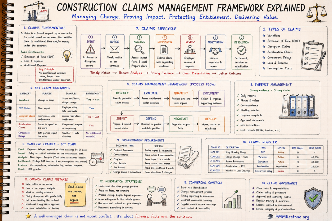
Construction Claims Management Framework Explained
A practical claims management framework for construction and infrastructure projects covering entitlement, records, analysis, negotiation and governance.
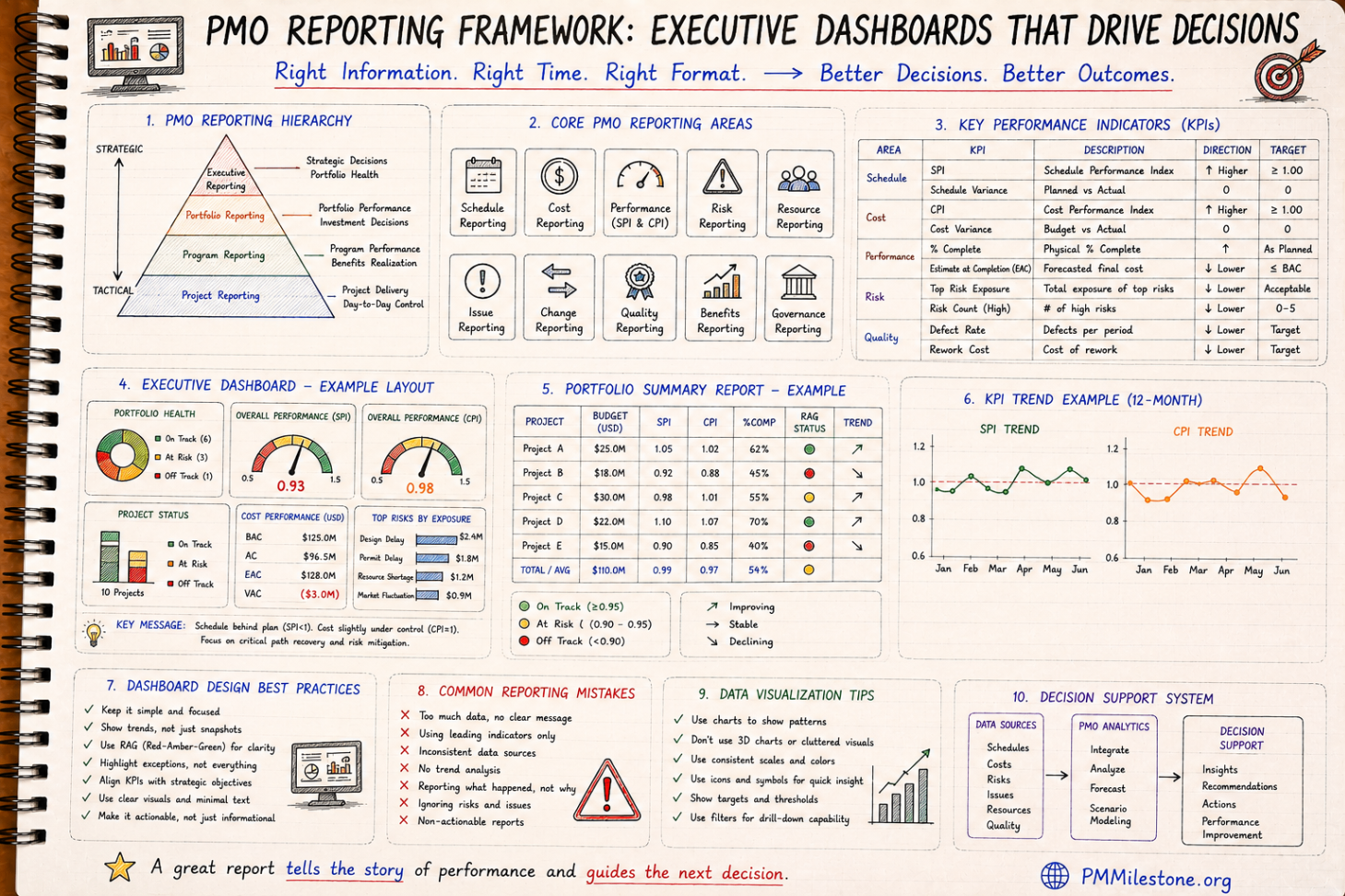
PMO Reporting Framework
A reference guide to executive PMO reporting covering dashboard structure, KPI choice, portfolio views, reporting cadence and common reporting mistakes.

Guides and Long-Form Articles
Practitioner-written explainers across EVM, planning, forecasting, risk and PMO design — read as a syllabus or as a refresher.