PMO Reporting and Executive Dashboards: Designing Decision-Grade Reports

Why most PMO reports fail
The typical PMO pack is 40 pages of charts, tables and traffic lights. The executive who is supposed to read it has 12 minutes between meetings, so they look at the cover summary, scan the headline metrics, and put it aside. The 39 pages of supporting detail produced by the controls team are never read by the audience they were written for.
This is not the executive's failure; it is a design failure. PMO reports are usually built around what the controls team produces rather than what the decision-maker needs. The fix is to invert the design: start from the decisions the executive has to make in the next month, work backward to the metrics that inform those decisions, and only then decide what supporting detail goes into the pack.
The KPI hierarchy: from operational to executive
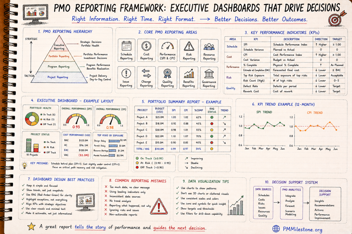
Project controls produces dozens of metrics. They organise into a four-level hierarchy. Level 1 is operational — the metrics planners and cost engineers use weekly: activity-level progress, daily productivity, weekly cost actuals. Level 2 is project — the metrics a project manager uses monthly: SPI, CPI, EAC, top risks, milestone status. Level 3 is portfolio — the metrics a PMO uses monthly: portfolio health distribution, capital draw rate, risk exposure aggregated across projects. Level 4 is executive — the metrics a CEO or board uses quarterly: capital efficiency, portfolio velocity, strategic milestone delivery.
The mistake most PMO packs make is dumping Level 2 detail into a Level 4 report. The fix is rigorous: every metric in the executive pack should answer a Level 4 question, with drill-down to Level 3 and Level 2 available on request but not in the main pack.
The three-question structure
Every executive report should answer three questions in order. Where are we? — current status across cost, schedule and risk. Where are we going? — forecast for the next quarter, with confidence bands. What should we change? — recommended actions for the decision-makers in the room.
The third question is what separates a report from a dashboard. Dashboards describe status; reports drive decisions. If the recommended-actions section is missing, weak or generic ('continue to monitor'), the report has failed regardless of how polished the visuals are.
Designing the headline page
The first page is the only page guaranteed to be read. It should fit one screen or one printed page and contain six elements: project or portfolio name and reporting period; a status indicator (RAG or numeric health score); three to five headline KPIs with trend; a 50-word narrative summary; the top three risks with next decision date; and the top three recommended actions with owners and dates.
Everything else in the pack is supporting evidence. The headline page is where the decision is made; the rest of the pack is where the decision is defended.
Visual design principles that compound
Three visual principles compound across PMO reports. First, consistency: the same KPI in the same position with the same colour treatment in every report. Audiences spend mental effort relearning a layout that changes month to month, and that effort is taken away from understanding the content. Second, restraint: fewer colours, fewer chart types, fewer fonts. A report with three colours and two chart types looks more authoritative than one with twelve. Third, density: when an executive is reading a single page, that page should contain as much decision-relevant information as it can without becoming cluttered. Edward Tufte's data-ink ratio is the right mental model.
Pair these principles with audience-specific design choices. Boards prefer narrative and concise visuals; capital committees prefer numbers and comparisons; project managers prefer detail. The same underlying data should be packaged differently for each audience, not stretched to fit all three at once.
The narrative: what to write and what to cut
The 50-word headline narrative is the hardest writing in the report. It has to be true, useful and decision-relevant. The structure that works on most projects is: one sentence on current status, one sentence on the most material change since last reporting period, one sentence on the most material risk to the forecast.
What to cut: anything that does not change what the executive will do. Process commentary ('the team continues to meet weekly'), generic risk language ('weather may impact progress'), and historical context that has already been reported are all candidates for the cutting room. If a sentence does not connect to a decision, it does not belong in the headline.
Operating cadence: the discipline that keeps reports honest
A report is only as honest as the cadence behind it. Weekly working updates, monthly project reports, monthly PMO reports and quarterly executive reports is the standard rhythm for capital portfolios. Each layer feeds the next, and each layer has its own quality control before it is published.
The single most valuable governance mechanism is the forecast review board, covered in the Project Forecasting pillar article. Separating the production of the report from the decision to publish it removes individual bias and elevates the credibility of the published numbers.
RAG, scores and the trap of false precision
RAG (red/amber/green) status indicators are popular because they are simple and visual. They are also frequently abused — projects that are clearly red are reported as amber because nobody wants to be the bearer of bad news, and projects that are amber drift into green over reporting cycles without any underlying change.
Mature PMOs replace pure RAG with a numeric health score derived from underlying metrics (SPI, CPI, risk exposure, milestone slip), with RAG bands set by formula rather than judgement. The PM Health Score and Portfolio Health Index calculators are useful starting points. The result is harder to game and easier to defend.
Drill-down architecture: when detail is needed
The headline page should not contain detail; the appendix should contain all of it. Modern BI tools (Power BI, Tableau, Spotfire) make drill-down trivial: every KPI on the headline page should be a link or hover-state that takes the reader to its supporting data, with full filtering and slicing.
This architecture lets the same report serve multiple audiences. Executives stay on the headline; project managers drill into their project; controls managers drill into the underlying activity data. One report, three reading modes, no duplication of effort.
Putting the PMO reporting system together
A working PMO reporting system has four moving parts: a defined KPI hierarchy with clear definitions per level; a consistent visual design pattern across reports; a written operating cadence with quality controls at each step; and a drill-down architecture that lets one source of truth serve multiple audiences. Build all four and reporting becomes a competitive advantage. Build only the first two and you have a polished pack that nobody acts on.
The Risk Management for Mega Projects and Project Forecasting pillar articles cover two of the most-consumed inputs into executive PMO reports. Pair them with the Executive KPI Dashboard tool to design the headline page that pulls everything together.
Frequently asked questions
How long should an executive PMO pack be?
One headline page is the only one guaranteed to be read. The supporting pack can be longer but should be structured for drill-down, not sequential reading.
RAG or numeric health score?
Numeric health scores driven by underlying metrics are harder to game and easier to defend than judgement-based RAG, although RAG bands derived from the score remain useful as a visual layer.
How often should an executive report be produced?
Monthly for project portfolios, quarterly for the board view. Weekly executive reporting is usually a sign that something is in crisis.
Who should own the headline narrative?
The PMO lead, signed off by the project director or portfolio sponsor. Controls produces the data; leadership owns the narrative.
Academy articles that build on this pillar
These newer Academy articles reference this Knowledge Pillar directly — continue with them to apply the concepts.
Next steps on PMMilestone
Use these pages to deepen the topic, verify terminology, compare real cases and move from theory into applied project controls practice.
Related calculators
Open the calculators referenced in this article and run them against your own project numbers.
PM Health Score
Composite project health score 0–100.
Open ReportingPortfolio Health Index
Roll-up score of portfolio performance.
Open ReportingExecutive KPI Dashboard
Single executive KPI score 0–100.
Open RiskRAID Log Severity Score
Weighted RAID severity calculator.
Open StakeholdersStakeholder Engagement Score
Net engagement score across stakeholders.
Open Earned ValueSPI Calculator
Schedule Performance Index — measure schedule efficiency.
Open Earned ValueCPI Calculator
Cost Performance Index — measure cost efficiency.
OpenOther knowledge pillars
Construction Claims Management Framework Explained
A practical claims management framework for construction and infrastructure projects covering entitlement, records, analysis, negotiation and governance.
PMO Reporting Framework
A reference guide to executive PMO reporting covering dashboard structure, KPI choice, portfolio views, reporting cadence and common reporting mistakes.

Guides and Long-Form Articles
Practitioner-written explainers across EVM, planning, forecasting, risk and PMO design — read as a syllabus or as a refresher.