The Complete Project Controls Intelligence Platform
9 intelligence modules, 170+ AI project controls prompts, executive dashboards, risk analytics, forecasting and recovery planning — all in one professional framework.
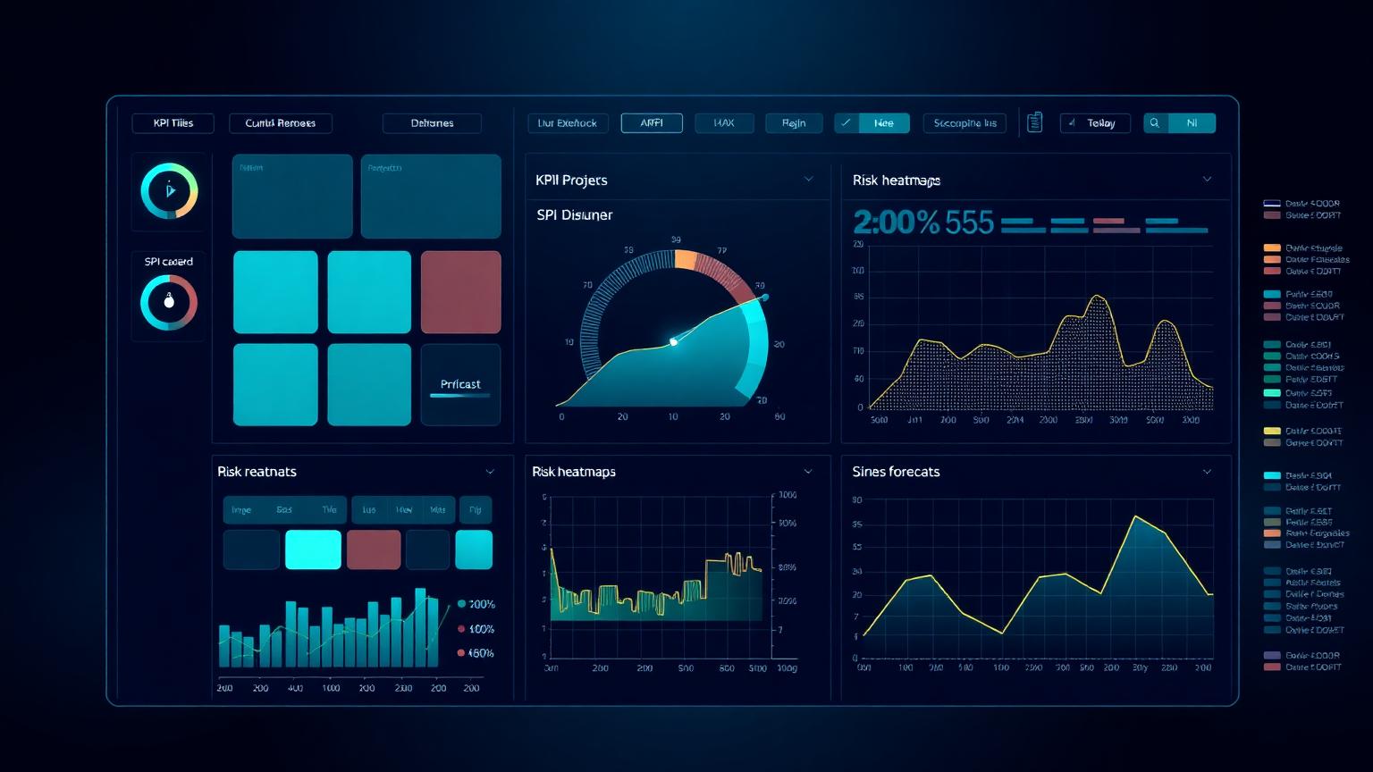
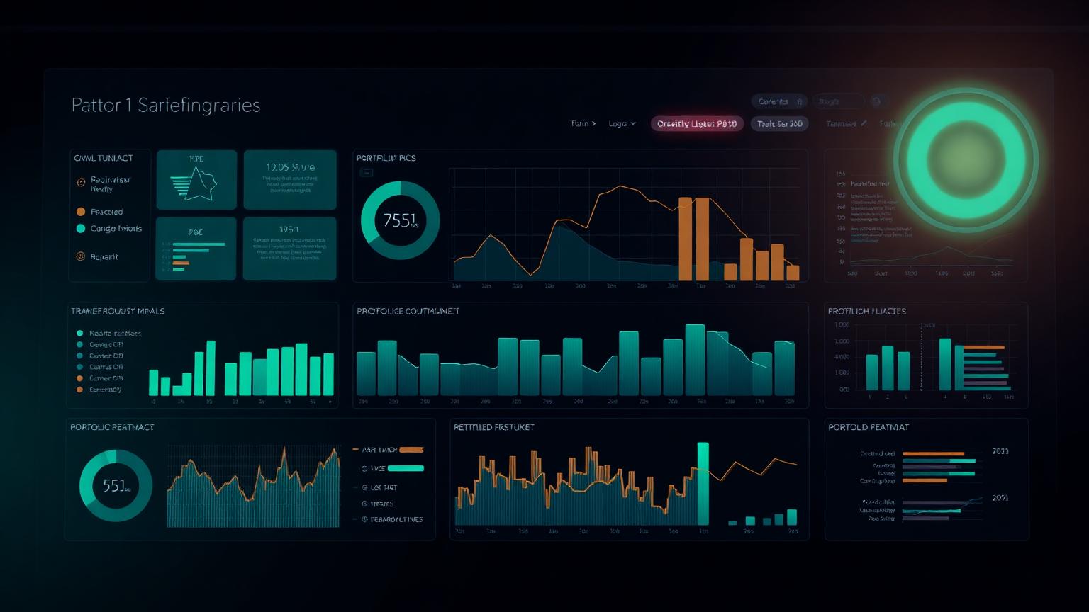
A working reference of the dashboards we use in real PMOs — executive KPI summaries, schedule and EVM control views, risk heatmaps, delay registers, cost forecasts, portfolio health and weekly controls reports. Each example is annotated with what it shows, who reads it, the KPIs that belong on it, the common mistakes that drain its value and the decision it is supposed to trigger.
Why a dashboard gallery matters
Most project controls dashboards fail for the same reason: they were built to display data rather than to support a decision. A PMO inherits a template, adds three more KPIs each time someone asks a question, and within a year the dashboard is a wall of numbers that nobody reads. The most expensive controls work in any organisation is the work that produces unread reports.
This gallery takes the opposite approach. Every example starts with the decision the dashboard exists to support and works backwards to the smallest set of indicators that make that decision possible. The annotations are deliberately practitioner-oriented — what to put on the page, what to leave off, and the mistakes that quietly erode credibility until the executive stops reading.
The eight sections mirror the eight conversations a controls team has each month. Executive summary, schedule, earned value, risk, delay, cost forecast, portfolio and the weekly controls rhythm. Read in sequence they form a coherent reporting stack; read in isolation each one is a self-contained reference for a single audience.
01 — Executive
Executive dashboard examples
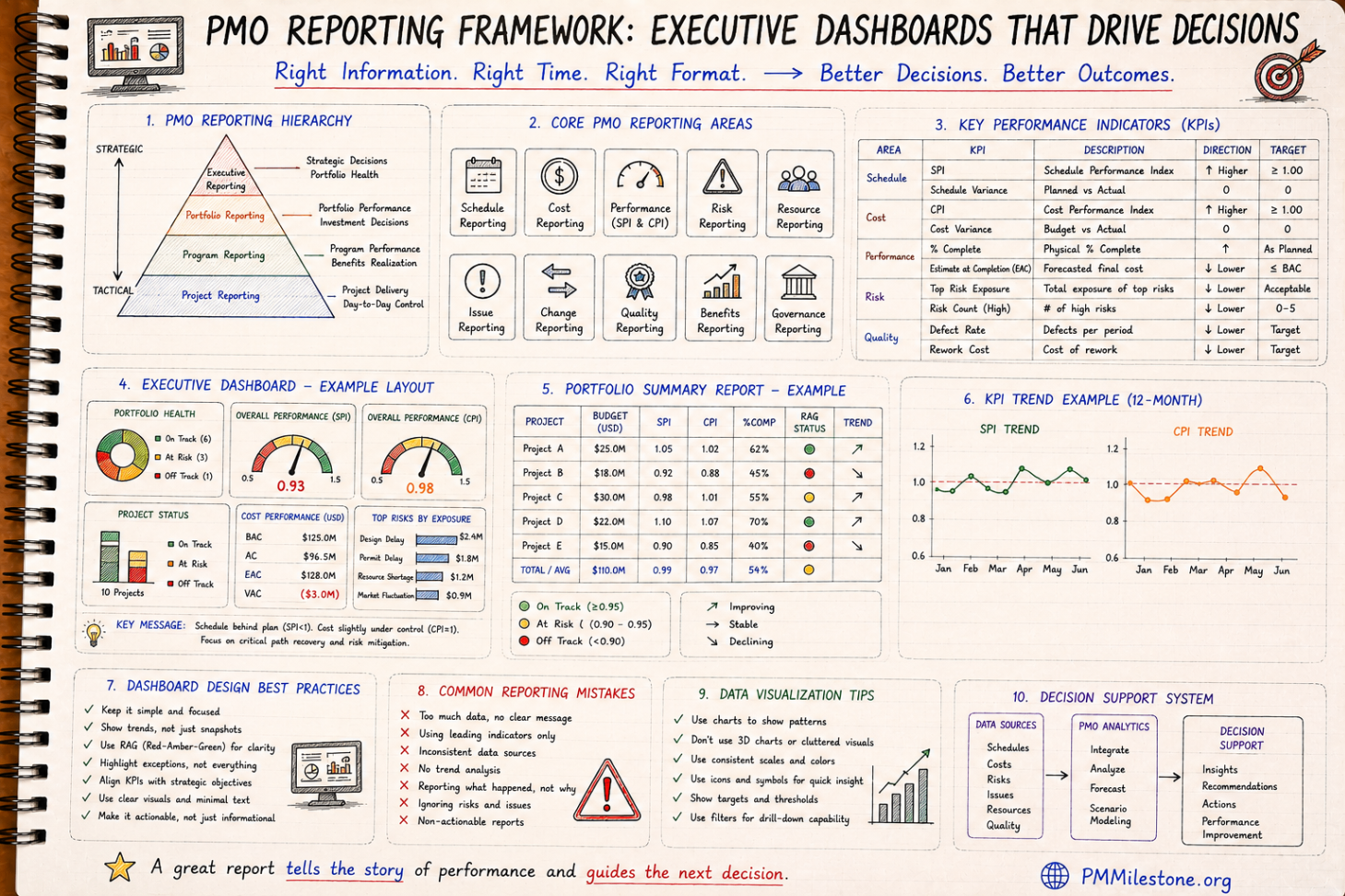
The executive dashboard is the one page a sponsor reads before a steering committee. It is not the place for a hundred metrics. It is the place for the five numbers that determine whether the project still has a credible path to its baseline, and the three risks that could change that answer before the next review.
01 — Executive
One-page executive KPI summary
What it shows
SPI, CPI, EAC variance against BAC, top three risks ranked by exposure, and a single trajectory arrow per area. Designed to be read in under two minutes by a non-specialist.
Listing thirty KPIs because nobody wanted to argue about which to remove. Reporting the current period without a trend. Using a RAG colour without a definition.
Decision it supports
Should we continue, replan, or escalate? The dashboard tells the sponsor which of those three conversations to have today, not next month.
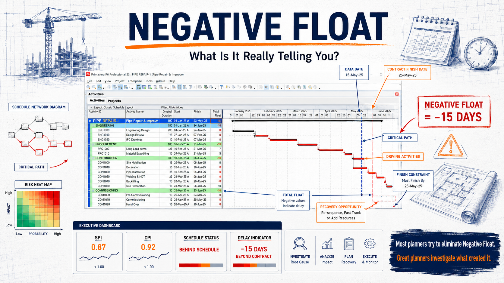
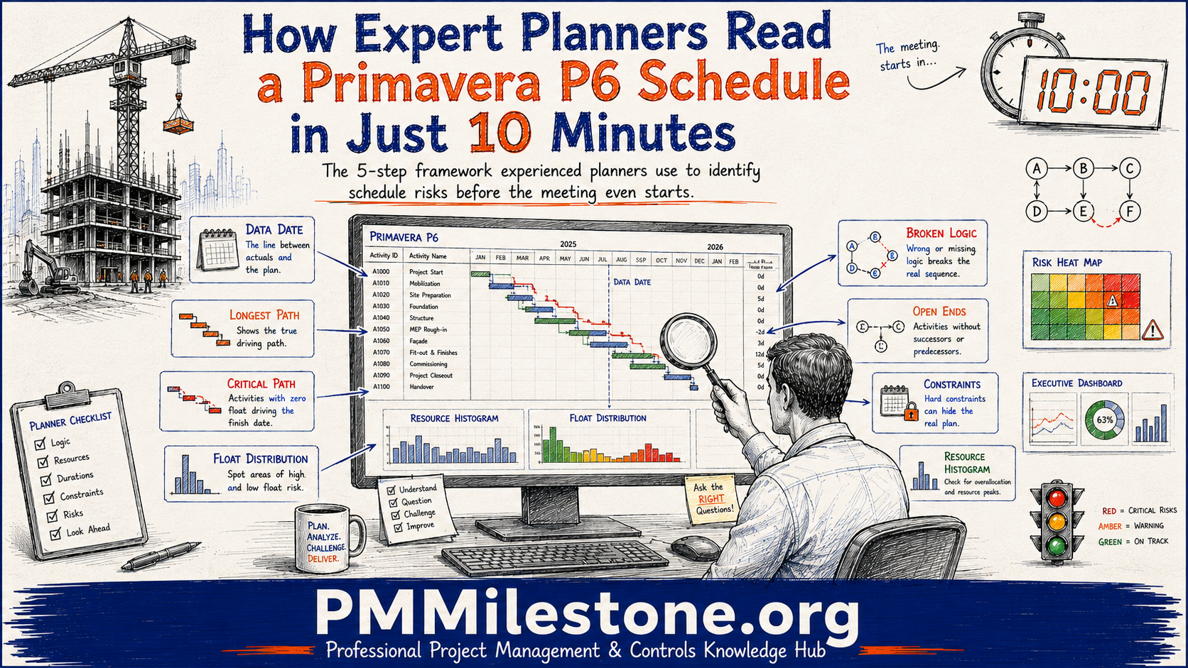
A schedule dashboard exists to make the critical path legible to people who do not open the planning tool. It is the bridge between the planner's view and the project manager's decision space.
02 — Schedule
Critical-path summary view
What it shows
The five to seven critical activities by latest float, current SPI per phase, and a small float-erosion trend chart. Each critical activity carries a status chip and an owner.
Who uses it
Project manager, scheduler, discipline leads in the weekly programme review.
Key KPIs
Total float
Free float on critical activities
Float erosion rate
Phase SPI
Forecast finish vs baseline
Common mistakes
Showing the full bar chart of a thousand activities. Reporting baseline-versus-actual without flagging where re-baselining happened.
Decision it supports
Where the next two weeks of planning attention should be spent. Which activities need a fragnet or a recovery plan now.
Earned value dashboards turn the three classic curves into a working management instrument. The point is not to display PV, EV and AC side by side — it is to surface the variances and indices in a way that drives the next conversation.
03 — EVM
Classic S-curve with variance bands
What it shows
PV, EV and AC plotted as cumulative curves with shaded SV and CV bands. A small index panel reports SPI, CPI, EAC and TCPI.
Who uses it
Controls engineer, PMO lead, sponsor in monthly review.
Key KPIs
SV
CV
SPI
CPI
EAC
TCPI
Common mistakes
Reporting EAC without TCPI — EAC alone does not tell the sponsor whether the remaining work is realistic.
Decision it supports
Whether the project can be recovered to the baseline with normal management attention, or whether it needs a formal replan.
Risk dashboards exist to make a register actionable. The most expensive risk registers are the ones nobody reads — usually because they bury the top exposures in a hundred low-probability entries that should have been closed long ago.
04 — Risk
Probability × impact heatmap
What it shows
Risks plotted on a five-by-five grid, sized by proximity and coloured by category. Top-ten risks listed beside the heatmap with owner and mitigation status.
Who uses it
Risk owner, project manager, sponsor.
Key KPIs
Top-10 exposure
Risks past mitigation due date
New risks this period
Risks closed this period
Common mistakes
A static heatmap with no time dimension. Without proximity, a low-probability risk that will be realised next week looks identical to one that will not be realised for two years.
Decision it supports
Where to spend mitigation budget this month, and which risks need escalation to the steering committee.
Cumulative open-risk exposure value over time, with a target reduction line. A mitigation backlog list with overdue actions highlighted.
Who uses it
Risk lead, PMO, project manager.
Key KPIs
Total open exposure
Mitigation actions overdue
Mitigation effectiveness ratio
Common mistakes
Counting risks rather than exposure. A project can close fifty trivial risks while the one risk that matters drifts past every milestone unaddressed.
Decision it supports
Whether risk management is keeping pace with the rate at which new risks emerge.
05 — Delay
Delay dashboard examples
A delay dashboard separates events from impact. The register lists what happened; the dashboard says what those events did to the programme and what they will cost.
05 — Delay
Delay event register with critical-path impact
What it shows
Each delay event with classification (EOT, concurrent, non-excusable), the windows it falls in, days of critical-path impact and the linked fragnet reference.
The programme broken into analysis windows, each with planned and actual progress, delay events landing in the window and the cumulative impact on the completion date.
Windows that are too long — concurrency and causation become impossible to separate. Windows that are too short — analysis cost becomes disproportionate.
Decision it supports
Whether the EOT entitlement claimed by the contractor is supported by a defensible window-based analysis.
06 — Cost Forecast
Cost forecast dashboard examples
Cost forecast dashboards translate accounting actuals into a forward-looking position. The hard part is not reporting the past; it is making the forecast credible enough that finance and delivery agree on the same number.
06 — Cost Forecast
EAC and TCPI panel
What it shows
Current EAC against BAC with a TCPI ribbon showing whether the remaining work is realistic at the current rate. A historical EAC trend chart shows whether the forecast is stabilising or drifting.
Who uses it
Cost engineer, commercial manager, sponsor.
Key KPIs
EAC
ETC
BAC
TCPI
EAC trend (3 periods)
Common mistakes
Reporting one EAC number per period without a trend. A flat EAC that suddenly jumps in month nine is a credibility problem, not a forecasting one.
Decision it supports
Whether to request additional funding, descope, or accept a forecast overrun.
Monthly burn rate with a forward projection against remaining budget and remaining contingency. A small risk-adjusted contingency drawdown curve sits underneath.
Who uses it
Project manager, finance partner, PMO.
Key KPIs
Burn rate
Contingency remaining
Runway months
Contingency drawdown vs plan
Common mistakes
Reporting contingency as a single number rather than a drawdown curve. The position looks healthy until it isn't.
Decision it supports
Whether contingency drawdown is tracking the assumed risk profile or running ahead of it.
Portfolio dashboards aggregate across projects so a PMO can see where attention belongs. The constant trap is averaging — a portfolio whose mean SPI looks healthy can still contain three projects in serious trouble.
07 — Portfolio
Portfolio health index
What it shows
One row per project with a composite health score, trajectory arrow, top risk, EAC variance and a small spark line for SPI. Sortable by trajectory, not by current colour.
Sorting only by current RAG. A green project on a steep downward trajectory is the one that needs the conversation, not the amber project that is stabilising.
Decision it supports
Where the PMO should deploy its scarce reviewing and intervention capacity this month.
Monthly demand by discipline across the portfolio against available supply, with peaks highlighted and a list of projects competing for the same scarce resource.
Who uses it
Resource manager, PMO, discipline heads.
Key KPIs
Resource demand vs supply
Peak utilisation
Resource conflicts open
Common mistakes
Aggregating demand without showing which projects are driving the peak. Without attribution, the conflict cannot be resolved.
Decision it supports
Which projects to delay, accelerate or resequence to balance the portfolio against finite resources.
08 — Weekly Report
Weekly project controls report examples
Weekly reports are the rhythm layer of project controls. They are not summarised monthly reports; they are a different document with a different audience and a different decision horizon — what happens on site in the next ten working days.
08 — Weekly Report
One-page weekly controls report
What it shows
Last week actual progress versus plan, this week look-ahead with critical activities, new risks and issues, and a small SPI/CPI tile showing whether the project is in or outside its weekly control band.
Who uses it
Project manager, discipline leads, site management.
Key KPIs
Weekly SPI
Weekly CPI
Activities completed vs planned
Constraints opened / closed
New risks
Common mistakes
A weekly report that reads like a monthly review. The look-ahead is the point — last week is context.
Decision it supports
What the project manager directs the site to focus on for the next ten working days.
Activities scheduled for the next three weeks with predecessor status, constraints to be released and a confidence indicator per activity based on constraint readiness.
Who uses it
Site team, planner, project manager.
Key KPIs
Activities ready to start
Constraints unresolved
Confidence percentage
Common mistakes
Publishing a look-ahead without confidence indicators — every activity is treated as equally ready, when in practice a third are not.
Decision it supports
Which constraints must be cleared this week to protect next week's progress.
Run the analysis
Calculators behind the dashboards
Every dashboard above is fed by one or more calculations. These open-source calculators reproduce the same logic on your own data, with no sign-up.
Six rules that make a controls dashboard worth reading
Independent of the tool, the platform or the company. These six rules separate the dashboards executives actually open from the ones that quietly become wallpaper.
Decision first, data second
Start from the decision the dashboard supports. Every metric on the page should map back to that decision. If it does not, it does not belong.
Trend before snapshot
A single-period number is almost always misleading. Three periods minimum, with a tolerance band so the reader knows what counts as a signal.
Tolerance bands, not RAG alone
Red, amber and green are useful only when the thresholds are defined. Without a band the colour is opinion.
One page or it is not a dashboard
Anything that needs scrolling is a report. Reports have a place — but the executive dashboard is not it.
Attribution on aggregates
If an aggregate looks bad, the reader needs to know which underlying project or activity drove it. Aggregates without attribution generate questions instead of decisions.
Defined freshness
Every dashboard carries the date and source of its data. Stale dashboards lose credibility faster than inaccurate ones.
From gallery to practice
Pair this gallery with the Academy and calculators
The gallery is the visual reference. The Academy explains the underlying methods. The calculators turn the methods into a working answer on your own data.
The twelve questions that come up most often in PMO design reviews, steering committees and controls audits. Practical answers from working dashboards, not theory.
What is a PMO dashboard and how is it different from a project status report?+
A PMO dashboard is a one-page visual instrument designed to support a specific decision — continue, replan, escalate, or intervene. A status report is a narrative document with context, commentary and supporting detail. The dashboard sits on top of the report; both are needed, but they serve different audiences and decision horizons.
How many KPIs should an executive dashboard contain?+
Five to seven is the practical ceiling for a one-page executive view. Beyond that the page becomes scannable rather than readable, and sponsors stop using it as a decision instrument. If you need more numbers, build a second tier behind the summary rather than crowding the front page.
Why include both SPI and CPI rather than just one schedule or cost indicator?+
SPI and CPI describe two different failure modes. A project can be on time and over budget, or under budget and slipping. Reading them together — ideally as a paired trend with tolerance bands — gives sponsors the diagnostic separation they need before they decide which lever to pull.
What is the right reporting frequency for executive controls dashboards?+
Monthly for the executive summary, weekly for the controls rhythm, and a rolling three-week look-ahead for site operations. Reporting cadence should match the decision cadence of the audience. A weekly executive dashboard usually signals a governance problem, not a reporting one.
How do RAG status colours go wrong on PMO dashboards?+
Red, amber and green only carry meaning when the thresholds are defined. Without a published band — for example green inside ±5% SPI variance, amber to ±10%, red beyond — the colour is opinion. The fix is to publish the tolerance band on the dashboard itself so the reader can audit the colour against the underlying number.
Should portfolio dashboards average project performance across the portfolio?+
No. A portfolio mean hides the projects that need attention. Sort by trajectory and by exposure, not by current RAG. A green project on a steep downward trajectory is the conversation the PMO director needs to have this month, not the amber project that is stabilising.
What is the difference between EAC and TCPI, and why report both?+
EAC is the forecast of total project cost at completion. TCPI is the cost performance required from this point forward to meet a chosen target — usually the BAC or the latest EAC. Reporting EAC alone tells the sponsor where the project is heading. Reporting TCPI alongside it tells the sponsor whether that destination is realistic given the remaining work.
How do you avoid 'dashboard rot' where reports grow stale and unread?+
Publish a freshness stamp and a named owner on every dashboard. Review the metric set every two quarters with the audience that consumes it. Remove any KPI that has not driven a decision in the past four reporting cycles. Dashboards die from accretion — the discipline is subtraction, not addition.
Do executives actually want to see EVM curves, or just the indices?+
Most non-controls sponsors want the indices with a small trend chart. The full S-curve belongs on the controls engineer's view and in the appendix of the steering pack. Reserve the chart real estate on the executive page for the trajectory and the variance bands.
How do risk dashboards stay actionable rather than becoming a wallpaper of low-probability entries?+
Rank by exposure and proximity, not by register entry count. Show the top ten exposures with owner and mitigation status, and close out or downgrade stale entries on a defined cycle. A register with three hundred open low-probability risks is a sign that nobody is doing risk management — it is doing risk archiving.
What KPIs belong on a weekly controls report that do not belong on the monthly?+
Weekly SPI and CPI inside a tighter control band, activities completed versus planned, constraints opened and closed, and a confidence-weighted three-week look-ahead. The monthly view is about trajectory; the weekly view is about the next ten working days on site.
How should a PMO dashboard handle re-baselining without losing credibility?+
Flag the re-baseline date directly on the dashboard, keep the prior baseline visible as a faded reference for at least two reporting cycles, and report variance against both baselines during the transition. Quiet re-baselining is the single fastest way to destroy executive trust in a controls dashboard.
Featured Academy
Featured Academy Learning Pages
The latest Academy tracks and knowledge pillars, sorted newest first.
Discover the Elite Project Controls System — a professional intelligence framework for modern project controls, forecasting, executive reporting, AI PM workflows and risk management.