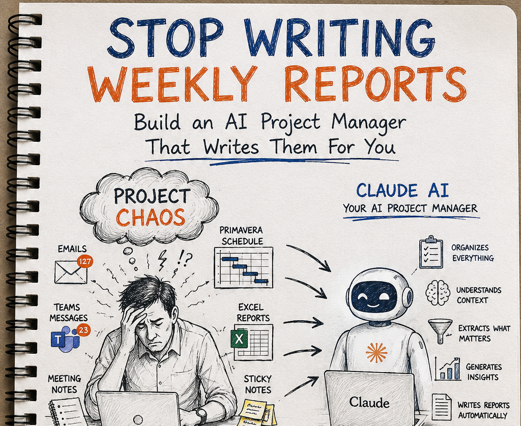
PMO Reporting Framework: Executive Dashboards That Drive Decisions

Executive reporting is a decision system, not a data dump
The most common PMO reporting mistake is assuming that more information creates better control. In reality, senior leaders have limited attention, limited meeting time and a limited appetite for ambiguous charts. An executive dashboard has one job: help the reader decide what requires intervention, what can continue as planned and what needs escalation. Anything that does not support that job is noise.
That is why good PMO reporting begins with hierarchy. Project teams need operational detail. Programme managers need integration risk and dependency visibility. Portfolio leaders need cross-project comparison and investment consequence. Executives need the smallest set of indicators that explain whether strategic objectives are being protected. When the same screen is forced on all four audiences, everyone gets the wrong level of detail.
The real skill in executive reporting is not collecting more data; it is editing the truth into a format that can be acted on without distortion.
Choose KPIs that support decisions, not vanity
A KPI earns its place on an executive dashboard only when it changes behaviour. SPI, CPI, estimate at completion variance, top risk exposure, milestone confidence, issue aging and portfolio health are useful because each can trigger action. A measure such as total tasks completed or number of meetings held usually cannot. It may describe activity, but it does not improve governance.
The strongest dashboards mix leading and lagging indicators. Lagging indicators tell you where the project is today. Leading indicators tell you where it is likely to go if current conditions continue. For example, CPI is lagging. Float erosion, aging unresolved issues or increasing risk exposure can be leading. Executives need both. Without lagging indicators they lose grounding; without leading indicators they arrive too late.
A useful design discipline is to force every KPI owner to answer five questions: what does this metric show, why does it matter, what threshold changes status, who owns the response, and what decision might it trigger? If those questions cannot be answered clearly, the KPI is not ready for executive use.
Executive KPI screen test
Is the metric clearly defined?
Does the audience understand what it implies?
Is there a clear boundary for escalation?
Who is accountable for response?
What action could this trigger?
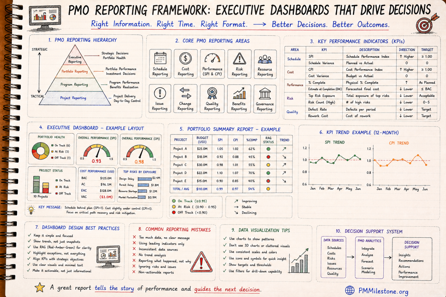
How SPI, CPI, risk and cost forecasting belong together
SPI and CPI are useful on executive dashboards because they compress schedule and cost performance into comparable indices. But alone, they are not enough. A CPI below 1.0 raises concern, but executives also need the estimate at completion impact, the top drivers of deterioration and the recovery action being proposed. Likewise, a schedule warning is more meaningful when shown alongside the milestone or workstream affected and the leading risks sitting behind it.
This is why the best PMO reports integrate KPI blocks rather than scattering them across unrelated slides. Schedule, cost, risk and governance are connected. A late design package may worsen SPI, increase rework risk, change EAC and create approval bottlenecks. One reporting frame should show that chain. When separate teams report each topic in isolation, leadership sees fragments instead of the operating picture.
For that reason, many PMOs pair the executive KPI dashboard with one deeper portfolio summary page and one RAID or risk-and-issue page. The first tells you if attention is needed. The second tells you where. The third explains why.
Portfolio reporting: compare projects without flattening context
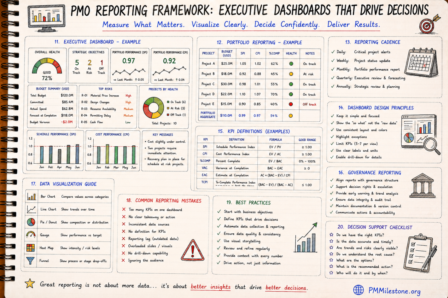
Portfolio reporting is harder than project reporting because comparability can become false precision. Two projects may both show SPI 0.95, but one may be recovering with manageable exposure while the other is drifting toward a procurement-driven cliff. Good portfolio reporting therefore combines normalized indicators with concise contextual notes.
A useful portfolio page usually includes project name, budget, SPI, CPI, percent complete, overall health, trend and one line of commentary. That is enough to sort attention without pretending every project is identical. Colour status should support the comparison, not replace it. Executives need trajectory as much as current state: improving, stable or declining is often more useful than a static amber rating.
This is also where the Portfolio Health Index becomes valuable. Composite indices should never hide underlying truth, but they can help portfolio-level leaders scan a large programme quickly and then drill into the outliers.
Dashboard design and data visualization rules that actually help
Most dashboard design failures are not aesthetic; they are cognitive. Too many KPIs, inconsistent colour meanings, unlabeled units, decorative charts and no visible takeaway all increase reading effort. Executive dashboards should be designed so the key message is visible in seconds. This usually means limited KPI count, consistent status colours, direct labeling and chart types matched to purpose.
Bar charts are good for comparison across projects or categories. Line charts are good for trend. Gauges are only useful when they compare a measure to a clear target or threshold. Pie charts are limited and often overused. Heat maps help where risk or intensity is the real story. A good PMO does not choose chart types because they look modern; it chooses them because they reduce interpretation time.
Equally important is narrative support. Numbers without context invite the wrong assumptions. Every executive dashboard should include a short key messages area that states what changed, what matters and what decision or action is recommended.
Reporting cadence and governance reporting
Cadence matters because stale reporting breaks trust. Operational alerts may be daily. Project status reporting is often weekly. Portfolio reporting is usually monthly. Strategic governance reviews may be quarterly. Problems begin when the cadence of the data source does not match the cadence of the decision. Executives quickly stop trusting reports that are visually current but operationally old.
Governance reporting deserves a place in the framework because many project failures are governance failures disguised as schedule or cost problems. Reporting should show unresolved approvals, aging decisions, escalations, audit concerns, change-control bottlenecks and accountability gaps where those materially affect delivery. That does not mean burdening the executive screen with committee detail. It means making governance friction visible when it becomes a delivery issue.
In mature PMOs, governance reporting is one of the clearest ways to distinguish symptom from cause. A red milestone is important. Knowing it is red because a decision has been sitting unapproved for six weeks is what allows the board to intervene intelligently.
Common reporting mistakes and how strong PMOs avoid them
The most common reporting mistakes are easy to recognize: too many KPIs on one page, no clear takeaway, inconsistent source data, outdated information, unclear formulas, overloaded visuals and reporting that describes what happened without recommending what to do next. Another classic mistake is designing reports for the producer rather than the audience. Analysts often want to prove completeness; executives need clarity.
Strong PMOs avoid this by enforcing measure definitions, controlling the KPI set, reviewing reports against decision usefulness, and iterating based on stakeholder behaviour rather than analyst preference. If leaders never refer to a chart in meetings, that chart has probably not earned its place. If questions are always about data credibility, source governance needs attention before design changes.
In practical terms, the best dashboards are surprisingly restrained. They show what matters, make thresholds visible and connect every problem to a next action. That restraint is a sign of maturity, not of simplicity.
Best practices for building a PMO reporting framework that lasts
Start with business decisions, not with screens. Define the minimum executive KPI set. Align each KPI to a stable definition, owner and threshold. Build the portfolio view next. Add drill-down layers only after the summary pages are trusted. Keep the reporting calendar stable. Make commentary mandatory where indicators move materially. Review source-data quality continuously. These disciplines sound basic because they are — and they are exactly what strong PMOs do consistently.
It also helps to document the framework itself: who the audience is, which decisions each report supports, how each KPI is calculated, when each dataset refreshes and what escalation rules apply. That documentation reduces dependency on individual analysts and improves continuity when teams change.
Finally, treat reporting as a living management product. Retire KPIs that no longer drive decisions. Add new ones carefully. Keep learning from the Project Failure Database, the PMO Dashboard Gallery and the broader Intelligence Center to refine what executive audiences actually need. Good reporting evolves, but it should never become unstable.
Frequently asked questions
What should always be on an executive PMO dashboard?
A small set of decision-driving indicators such as schedule status, cost performance, forecast position, top risks or issues, and a short statement of the actions or decisions required. The exact mix depends on the organization, but clarity matters more than volume.
How many KPIs should an executive dashboard include?
Usually only a handful per view. Many strong PMOs keep executive screens to five to seven core measures, then provide drill-down detail elsewhere for managers who need it.
Should SPI and CPI both appear in executive reporting?
Often yes, because together they show schedule and cost efficiency. But they should usually be paired with forecast commentary, top drivers and recommended action so leaders can interpret them correctly.
What is the biggest mistake in portfolio reporting?
Flattening context. Comparable indicators are essential, but portfolio leaders still need one-line explanations or trend cues so two similar scores are not treated as identical situations.
How often should PMO executive dashboards be refreshed?
That depends on decision cadence, but weekly for operational portfolio control and monthly for executive review are common. What matters most is that the refresh cycle matches the decisions the report is meant to support.
Academy articles that build on this pillar
These newer Academy articles reference this Knowledge Pillar directly — continue with them to apply the concepts.
Related learning for this topic
Hand-picked Learning Tracks, Knowledge Pillars, publications and case data that extend this article.
Next steps on PMMilestone
Use these pages to deepen the topic, verify terminology, compare real cases and move from theory into applied project controls practice.
Related calculators
Open the calculators referenced in this article and run them against your own project numbers.
Executive KPI Dashboard
Single executive KPI score 0–100.
Open ReportingPortfolio Health Index
Roll-up score of portfolio performance.
Open Earned ValueSPI Calculator
Schedule Performance Index — measure schedule efficiency.
Open Earned ValueCPI Calculator
Cost Performance Index — measure cost efficiency.
Open RiskRisk Exposure Calculator
Quantify Expected Monetary Value of a risk.
OpenOther knowledge pillars
Construction Claims Management Framework Explained
A practical claims management framework for construction and infrastructure projects covering entitlement, records, analysis, negotiation and governance.

Guides and Long-Form Articles
Practitioner-written explainers across EVM, planning, forecasting, risk and PMO design — read as a syllabus or as a refresher.

Q&A and Exam-Style Questions
Concept questions in the style of PMP / PMI examinations, plus practical scenarios from real construction and PMO environments.